Monday, July 13, 2020

Submarine shaker card with Trinity Stamps

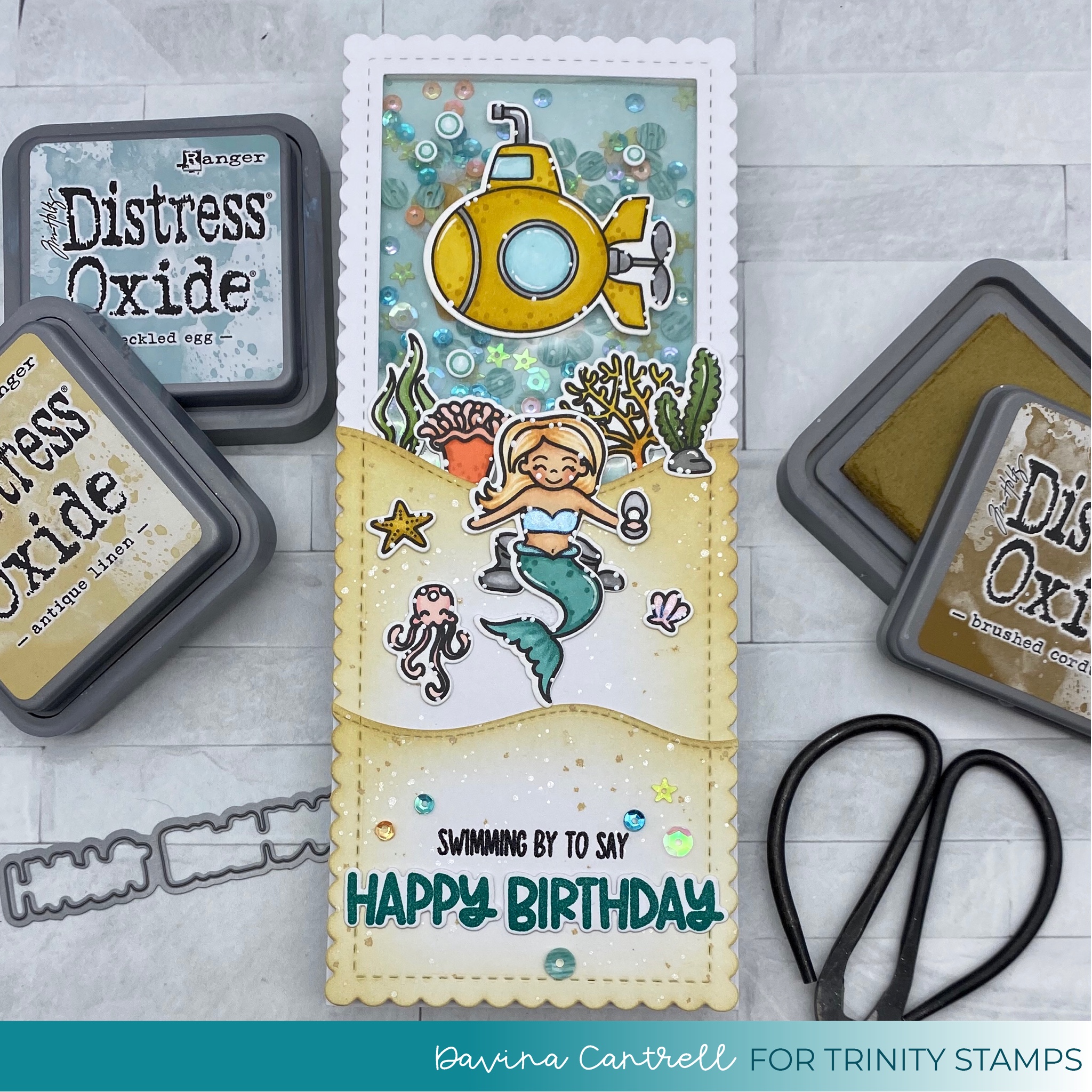
Hello crafty friends! Today I have a little under the sea, submarine shaker card to share with you. I used all Trinity Stamps products to create this slimline shaker and the results were so much fun. 


I used the Scallop Card Panels to cut two large pieces from bright white cardstock. I also used the Large Stitched Frame from the Slimline Frame and Fold Die set to cut out the inner & upper portion of one panel. This will be where all the shaker action will take place. On my second panel I cut a hill that will cover the very bottom of the window, and then I cut a second hill from the remaining paper for a layered sandy hill. I gently inked the hills using Antique Linen and Brushed Corduroy distress oxide inks, leaving plenty of white showing. After splattering with brown ink, white ink, and glittery perfect pearls I put aside to dry. I cut a piece of cardstock to fit under the scallop frame without showing, and inked the upper area with Speckled Egg Distress Oxide ink, also leaving plenty of white, and splattered with white ink and perfect pearls. 

I colored a couple of submarine images during the week, so I wanted to use the sub in the watery shaker area, and I stamped and colored a mermaid and plenty of coral from the sets Mermaid Wishes And Ocean Reef Builder. I colored these up and added some glittery wink of Stella to some of the images after diecutting using the coordinating dies.  

I used liquid glue to layer all of the scallop layers together, and stamped my sentiment at the bottom. I heat embossed the smaller words, but stamped with colored ink and die cut the Happy Birthday from the Ocean Reef Builder set. I used a variety of adhesives to attach my images before creating the shaker.

I cut a bright white panel to 3.5x8.5 And glued my smaller inkblended panel in the center. I liberally applied powder with my powder tool to the blue inked portion, and added a heaping tablespoon of sequins mix. On the back of my scallop frame, I adhered an acetate sheet with score tape, then framed out the window with trimmed Tombow foam tape. It is thicker than Scotch brand, so I had no need to double it up. I framed the rest of the card panel with foam tape and applied it over my blue panel and sequins. Then I mounted it all onto my cardbase. Finally, I finished up this card by applying a variety of sequins that are included in the mix I used inside the shaker. I think the little starfish are my favorite. This was one of my favorite shakers that I have made, I think the Tombow tape really made a difference in easels thickness for the sequins and application. 

Thanks for stopping by, Davina 


Saturday, July 11, 2020

July Color Challenge

Hello crafty friends. Today I’m sharing a card I made using the new Heffy Doodle release and the July Mood Board. 


I love using color boards to inspire my color choices for projects and I love the challenge it provides my imagination for creating scenes. When I saw this Fiery color board I instantly started brain storming possible scenes to make. 

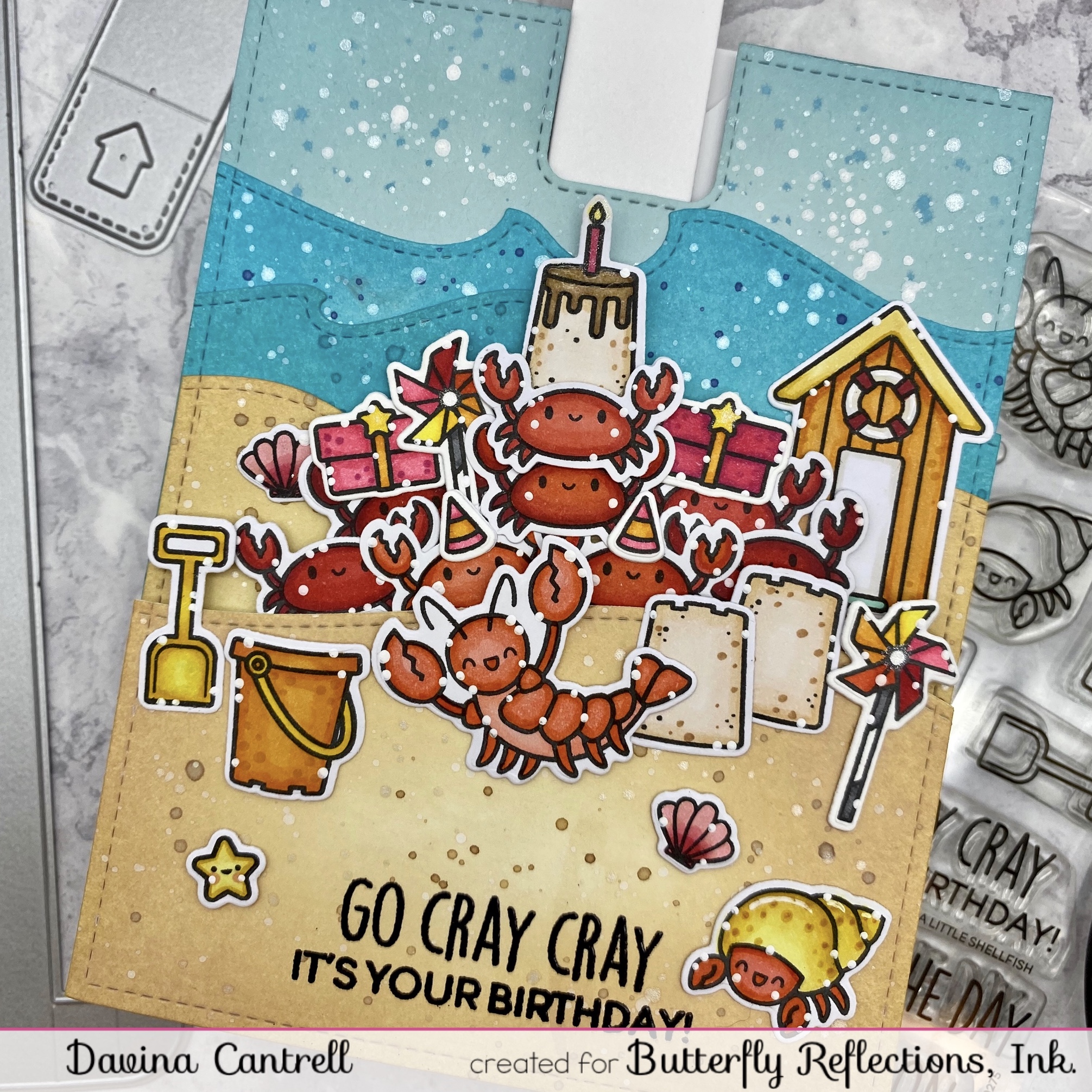
My mind saw candies and so much more. But, I decided on a pile of crabs, like a sort of flash mob birthday party. The new Heffy Doodle release has great party accessories in the new A Little Shellfish Stamp set, I couldn’t resist adding gifts, party hats, and a pinwheel to my party crowd. 

I stamped and colored so many little crabs using these colors, and added them to the new slimline new pulltab so they could surprise you from behind the sand bar. I really love the results and hope that you head over to the Butterfly Reflections Ink Blog And see all the details on how I created this card. 

If you are feeling inspired to play along and use the Moodboard please make sure to use the #brimoodboard and link you card into my blog using the InLinkz button for your chance to win a $20 gift certificate to the shop! The link will be open until the end of the month on July 31st TIL 11:59 pm. We will use a random number Generator to select a winner from the eligible entries using the current colors from this months Mood Board. All brands the are carried by Butterfly Reflections Ink are welcome. 

Thank you for stopping by,
Davina


You are invited to the Inlinkz link party!

Click here to enter

Saturday, June 13, 2020

Oh Gnome #brimoodboard color challenge


Hello crafty friends. Davina here on the blog, with some color board inspiration for you today. I made a Slimline scene bursting full of Lawn Fawn goodness, that I hope you love. The June BRIMoodboard is a very zen/spa like color combination of wood grain, both bright and bold greens, and a lavender. At first one would think these colors difficult to use, but since green and purple are complimentary colors on the color wheel, they always look fabulous together. 

I pulled out about 7 different Lawn Fawn sets to create this bursting meadow scene, and the new Lawn Fawn Slimline dies both the Large And Small sets. I had a much different idea for this project when I first sat down. And about 5 hours later I had something very different than when I thought I was going to make. While flipping through my sets looking for images I wanted to use, I pulled out Oh Gnome, Gleeful Gardens, Frosty Fairy Friends, Fairy Friends, Jump for Joy, Butterfly Kisses, and A Bug Deal. I stamped about 30 images onto my Neenah classic crest cardstock using my stamp platform. I used the coordinating dies to cut out all of the images before coloring. That way I could create a scene like a puzzle, and only color the images I was going to use. 

I used the largest slimline die to cut a piece of Lawn Fawn Kraft Cardstock that I stamped some wood grain onto using Lawn Fawn Crunchy Leaf Brown ink. Then Using the next largest die, I cut a piece of Bristol Smooth Cardstock that I inkblended with Shaded Lilac & Dusty Concord. I splattered the panel with purple ink, white ink, and glittery perfect pearls. I cut some remnants of green cardstock with the same sized die and added a grassy border to each using the Lawn Fawn Grassy Hillside Borders To create a rolling hillside. I inked the edges of the grass using Mowed Lawn & Lucky Clover

Then I colored all of my images using my copic markers in color combinations that matched the mood board. I really enjoyed using all of the different shades of wood brown, green, and lavender on these images.then, using a variety of adhesives, I mounted all of the images onto the scene. I decided the little gnomes and the hummingbird needed a little bit of a boost, so I popped them up onto die cut fun foam. I really love the dimension it gives. I glued my layers together then added a little Lawn Fawn Chunky Glitter To the roof of the house do the center of my card can have a little Razzle Dazzle. 

I really love how this turned out and I hope you do too. If you are feeling inspired to use the Moodboard please make sure to use the #brimoodboard and link you card into my blog using the InLinkz button for your chance to win a $20 gift certificate to the shop! The link will be open until the end of the month on June 30th TIL 11:59 pm. We will use a random number Generator to select a winner from the eligible entries using the current colors from this months Mood Board. All brands the are carried by Butterfly Reflections Ink are welcome. 

Thank you for stopping by,
Davina

You are invited to the Inlinkz link party!

Click here to enter

Monday, June 8, 2020

Reverse Confetti 7th Birthday Hop

Hello Fetti Friends! Today we are hopping along to celebrate the the 7th Birthday Release for Reverse Confetti. It is a little delayed due to the pandemic... but we’re still having a party and a great release. I feel blessed to be participating in this Hop as a Fetti a Friend, and hope you love what I’ve created.


I’ve got two fun cards to share with you today using some of the amazing new products. First up is this “Woof!” Just fur you card that I created using the new Corgi Cuties stamps and dies. The size of the little puppies is perfect, with plenty of space for texture and shading. There are few little accessories in the set of of corse I had to include them. I inkblended a simple light blue background to match the patterned paper background from an older paper pad I’ve had called Fright Night. Then I splattered with white ink and glittery perfect pearls. I added an additional paper layer, for a pop of color, and nestled my corgi cuties under the sky and heat embossed sentiment. The bubble clouds are from the Over the Rainbow die set. 

Once I adhered all of my layers onto the cardbase using scor tape, I added a few sparkling clear sequins to finish it off. 

The second card I made uses the fun freebie set that is included with qualifying orders. It is called friendly rainbows and has a lot of punch for a little set! The main large image had Hello Friend across the arch. Or you can stamp the bold sentiment without the rainbow. It also has a two different types of clouds and a couple of sentiments. 

I cut some soft yellow textured cardstock out with the Snowball Cover Plate  for a fun bubble look. Then I gently inked the edges of the panel with a darker yellow so that it matched my colored rainbow. I adhered my colored images onto a pastel inked background and popped it up on foam tape so the cute bubble texture was visible underneath. I also think it’s the perfect size to put atop a tall slimline card too! 

Saturday, May 16, 2020

Om Nom Nom with Penguin Palace

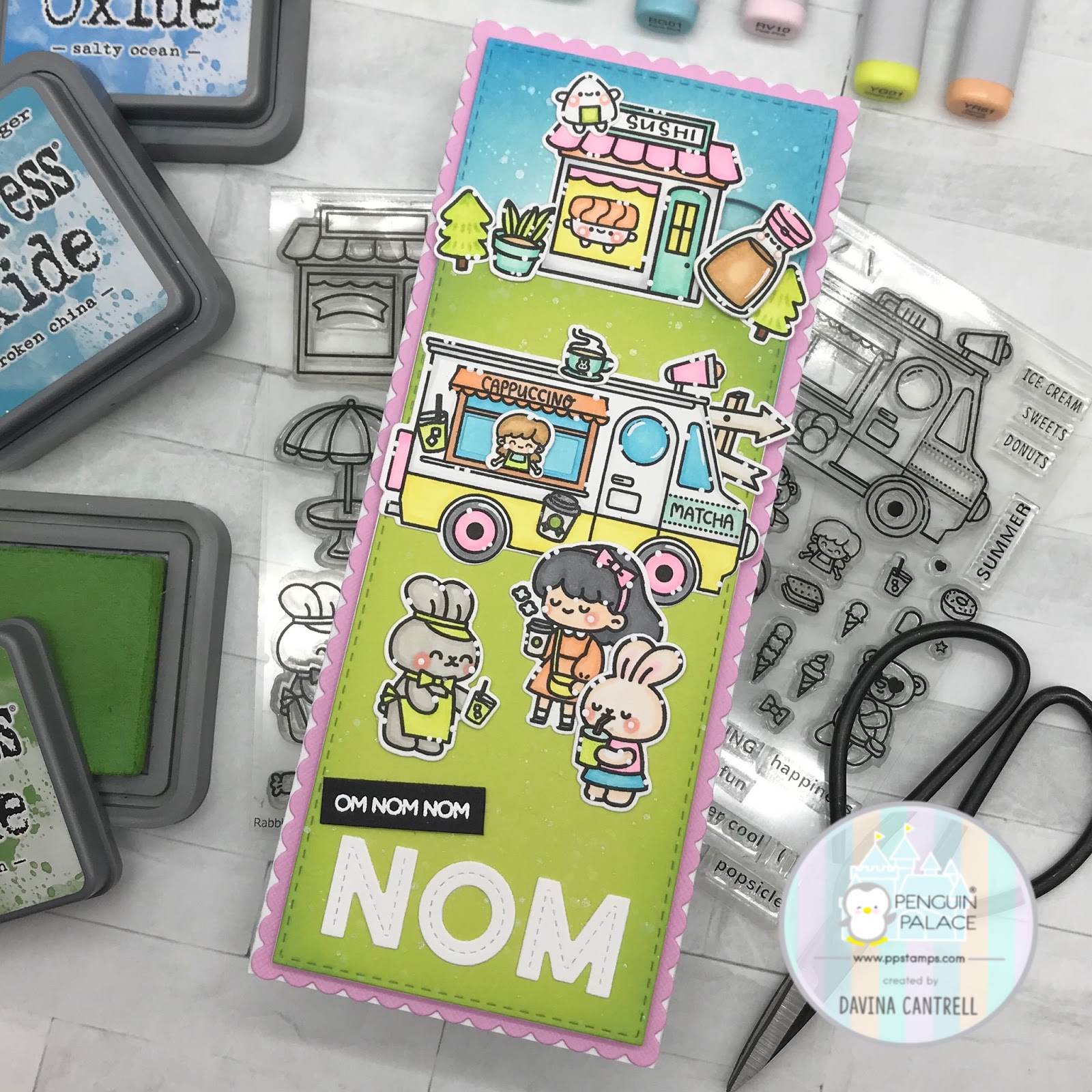
Hello my friends! Hopefully you are doing well and enjoying a beautiful spring morning. Today I am sharing a fun slimline card that I made using many Penguin Palace Stamps products. I think I pulled images from at least 5 sets and their coordinating dies.

I began this fun projects by stamping images from many sets like Rabbit CafeThe Sweetest TruckFun Adventure, and Never Give Up. I didn’t have a specific plan yet, so I die cut all of the images before coloring. It was like a puzzle.

I used my favorite Slimline Series dies from Trinity Stamps to cut several panels. I cut a piece of scrap pink cardstock as my large scalloped base. Then two stitched panels for the scene. One from white Bristol Smooth, and one from a bright lime green for grass. Then I played with the solid white piece and my die cut images, to come up with a plan. Once I had a rough idea, I colored up all of the images using a sherbet hued rainbow of colors.

In my imagination, I wanted a food truck and food stall like at a fairground or event. So I turned the Rabbit Cafe into a sushi stall, and my Ice cream truck into a Coffee Truck. The soy sauce was supposed to be like one of those large inflatable wiggly things that are outside of shops and at fair grounds. Dancing around attracting people. So I created a tilt slider for it to wiggle back and forth.

I masked the ice cream images on the truck and replaced them with coffee and matcha tea images. There were some tiny coffee themed words from There’s No One Like You, that fit onto the truck, and I put a little cappuccino from Rabbit Cafe that I put on top, after removing the Air conditioner.
Once my images were all colored up and put together, I inked the sky area on the white paper and trimmed the green cardstock for a grass layer. I also inked the edges for some depth, and splattered with diluted white ink and glittery perfect pearls. 

I created my top Sushi area and my lower sentiment area, before placing all of the center images, so they would be spaced well. Then I mounted the panel onto the pink scalloped paper with foam tape. Once I adhered this to my cardbase I realized that my swaying Soy Sauce just looks like a giant soy sauce, but hey, it happens haha.

I really love how all of these images work together and enjoyed creating this huge scene. I hope you like it and make the time to create something a little “extra” this weekend.
Davina

Tuesday, May 12, 2020

Seas the a day with Penguin Palace Stamps

Hello my inky fingered friends. Today I’m sharing a bright and colorful underwater scene. Now that summer is practically beating down the door, I feel such a joy at getting to prepare beach and ocean themed cards. Which is what’s I made for you today!

Last years Summer Release from Penguin Palace was incredible. Full of large, fun images and gorgeous characters that just make me smile. My favorite thing ever, is when I can combine multiple sets to create unique scenes. I was so excited with this Spring Release, when I saw I could combine sets like The sweetest truck & Never Give Up to create the Sushi Food Truck, and with this card, I combined Summer Sunshine & The More we Get Together. It’s like they were meant to be.

Instead of using the incredibly cute little girls from the Summer Sunshine set, I focused on the cool cats. There’s  a cute cat fish in the ocean set too, I don’t know if the fish ate the cat, or the cat is wearing a fish costume, but it’s adorable and the illustrations coordinate.

I stamped a ton of images from both sets and colored them up using bright summery colors, then die cut them using the coordinating dies. I cut the stitched layers from several panels of Bristol smooth cardstock, and inked them up using Distress Oxide Inks. After some splattering of water and white ink, I splashed a little watery ink on there too for texture.

I stamped Seas the Day onto the shortest sand layer then adhered all of the pieces together.  I glued down my stamped images creating a split level scene. Then I popped up this entire panel with foam tape and secured it to some patterned paper that I die cut using the Cross Stitched and Dots layer dies. I have to say that these dies and the Dots Meets Dashes are my favorite rectangle layer dies. The extra dot detail is so much fun and adds a lot of interest to paper layers. They are really worth having in your crafty arsenal.

I hope you like this and practice combining stamp sets on your own projects. Thank you,
Davina


Friday, May 8, 2020

May BRI Mood Board Color Challenge

Hello Crafty Friends, Davina here to share the new May BRIMoodboard Color Challenge. I really love this color combination of peachy pink, mango, turquoise, and indigo blue. It’s very boho chic, and trendy right now.

I wanted to use it in a non traditional way, and “glow up” a typical child’s card design, into a something that could confidently be given to a teenager or adult. It’s amazing how using an adult color palette can totally change up a unicorn and rainbow.

I used a stamp set that I illustrated for Trinity Stamps  called Let the Good Times Roll, and the coordinating dies.  I also used the Rainbow Dies and Melted Icicles no hole sequins from Trinity Stamps. To create the scene I used the Grassy Knoll Dies and love the puffy clouds that are included. I inkblended with Distress Oxides using faded Jeans, Peacock Feathers, Tattered Rose, and Dried Marigold. Then I stamped and copic colored my images using the same colors. I really love the way this card turned out, and hope it inspires you to get out your stamps and create something new.

So let’s get out coloring mediums of choice out and get busy! I will have an InLinkz button at the bottom of this post for you to add your project, using the featured May Mood Board, and companies that are carried by Butterfly Reflections Ink (which is most). This link will be open until May 31st at 11:59 pm. We will randomly select an eligible project from those linked and using the hashtag #brimoodboard to win a $20 gift certificate to the Butterfly Reflection Ink shop.

Let’s be nice and have fun! You can enter up to 4 cards using the InLinkz button. And you must be using the colors inspired by the current Mood Board.


You are invited to the Inlinkz link party!
Click here to enter