Wednesday, September 18, 2019

Autumn Release with Trinity Stamps

I’m celebrating the Autumn Release with Trinity Stamps with a pair of cute cards and by participating in their huge release blog hop. Make sure your hop along and leave a comment on the Trinity Blog for a chance to win a $25 gift certificate to their website.

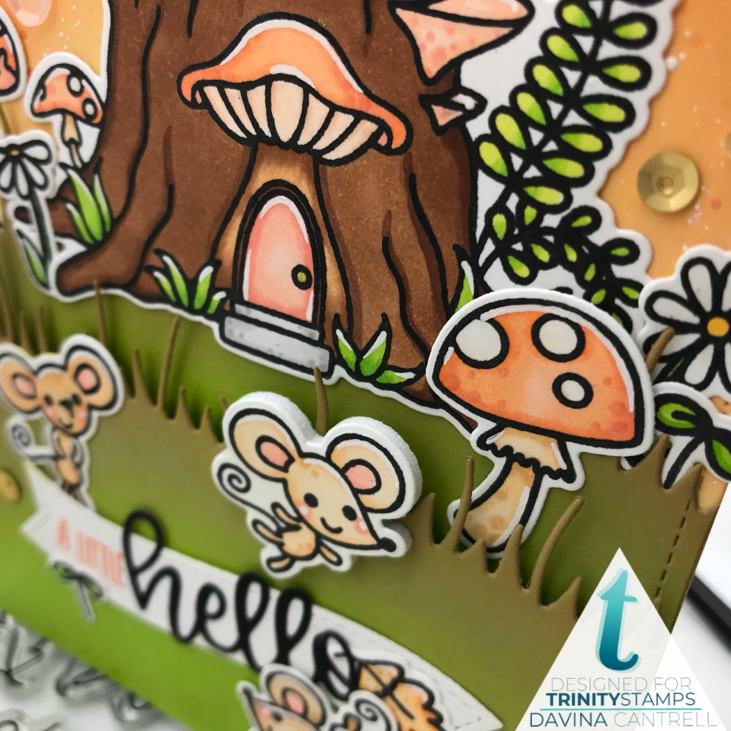
I have two new projects to share with you today. My first card features a new set and matching dies called Shoe Sprites. The large main image in this set is a super cute hiking boot that has been turned into a gnome home. There is also a cute pair of resident gnomes that call this boot home. There are quite a few cute accessories to this set and I used them all!

I cut a panel of Bristol Smooth cardstock that I inked up with using my Trinity Blending Buddy blending brushes, and 3 Distress Oxide Inks, Tumbled Glass, Broken China, and a hint of Mermaid Lagoon. I splattered it with clean water, white opaque ink, then metallic gold ink.  Then I cut a panel from grass green cardstock that I cut two grassy layers from. I inked just the edges of the grass pieces with Mowed Lawn and Mermaid Lagoon Distress Oxide Ink. After stamping my images with my stamp platform and achieving complete coverage, I colored my images with Copic markers and highlighted with white gel pen after cutting out. Then I marked where I was going to place the shoe very lightly and tucked all of my background images in place, knowing where the boot would cover. I mounted the boot on Fun foam then attached it to my panel.


I used foam tape to attach my shorter grass panel and adhered my gnomes with liquid glue. There are a few hat options in the set, and a couple of little smoke puffs as well (for the chimney), and I really love how full of fun my scene is. I combined a few words from the Happy Senti-mini set and stamped them in a word bubble from my stash. This set blends wonderfully with another new set called Mouse House that I shared on Sat.

The second card I have today is also full of Fun Fall images. I used Trinity’s Narrow Card and Bookmark to get this wonderful stitched scallop panel and the stitched banner. I cut lots of paper layers to mount this on to achieve a nice full slimline card. I also cut a Bristol Smooth layer that would fit right inside the stitching. I inked it up with my Blending Buddies and Distress Oxide Inks in  Spun Sugar, Worn Lipstck, Dried Marigold, and Rusty Hinge. After splattering with clean water and white opaque ink I used the new Autumn Trees stencil and gold glitter paste to create some falling leaves.

I stamped out images from last falls Seasonal Sweetheart, and combined them with this years Nutty Squirrel using my Stamp Platform. Then colored everything with my copics using shades of orange and tan.  In really love the monochromatic look, and that the tans look like the Kraft paper I used for the scallop layer and card base. After mounting all of my images onto my slim panel I added a sprinkling of sequins. I really loved the look I achieved by combining these different stamp sets and can’t wait to see what you come up with as well.
Davina

Thank you so much for stopping by and head on over to the next blog on the list Emelie Hessler. 
Trinity Stamps Blog
Brenda Noelke
Christine Burillo-Kirch
Courtney Kreeber
Davina Cantrell (you are here)
 Emelie Hessler
Emily Mydlowski
Jeannie Lieu
Katie Brooks
Jenn Bena
Shanna Slater
Seeka

Monday, September 16, 2019

Bonjour with Penguin Palace Stamps

Bonjour! Today I have an Aqua and Butterscotch colored card to share with you that I made using Penguin Palace Stamps. I’m stretching my summertime release to create “Fall Feels” and I really like the Indian Summer vibe this color palette provided.

I have many loose 6 x 6 pieces of patterned paper all stacked up and I thought I might as well use some with bold colors while I can,  before it gets too Christmassy. I chose this lovely plaid piece and fortunately found a piece of matching aqua cardstock in my scrap bin.  I used some cross stitch frame dies to cut the plaid and then some white Bristol smooth. I used my paper trimmer to cut the aqua piece 1/8 inch larger than the white panel so I could have a slight visible layer. Then I inkblended some coordinating Aqua Distress Oxide Inks onto my Bristol Smooth cardstock and blended into white about an inch from the bottom. I splattered my panel with clean water, then opaque white ink, followed by a shimmery yellow ink that almost looks gold in the reflective light, but is more mustard.

I used my Stamp Platform to stamp the cute images from the Fun Adventure set onto bright white Neenah cardstock, before coloring with my Copic markers. I cut out the images with the coordinating Penguin Perfect Cuts then highlighted with my white gel pen. I laid my scene out across the bottom portion of the panel making sure to layer the mountains just a little under where her head would lay. Then I tucked in the tree, and mounted the trail of puffy clouds across the top. I attached the main images across the bottom and decided a nice large die cut sentiment would be perfect. I glued down a stamped word across the top and surrounded it with lovely honey gold sequins.

I mounted my image panel onto the aqua layer with liquid glue so I could wiggle it straight, then used Scor Tape to attach that to the plaid. Then mounted it all onto my cardbase. This was one of the fastest cards I ever created, but honestly, I just love the bold colors and the wow factor it gives! I hope you like it and that your next card comes together as easily as this one did for me! Thank you for dropping in,
Davina

Friday, September 13, 2019

Sneak Peek time with Trinity Stamps

Hey there crafty friends! Today I get to share a much anticipated sneak peek of the upcoming fall release with Trinity Stamps. I’ve illustrated a couple of these, and I’m very excited to share with you. Today’s sneak includes a card I made using The House Mouse set. It’s incredible, and includes all of the images on this card (sentiments excluded).

The little trio of mice live in this adorable tree stump surrounded by lush grass and vibrant toadstools.  I created a fall like scene using distress oxide inks in rich warm colors, but this will be a great set year around. I inkblended my sky using Trinity’s blending brushes and distress oxide inks in scattered straw, dried marigold, and ripe persimmon. A few water and white ink splatters make it so fun. Then I cut two grassy hills from green cardstock. I also blended some crushed olive and a tiny amount of brushed corduroy onto the edges for a autumn like feel.

I stamped all of my images in black ink using my stamp platform. That always ensures crisp dark lines, perfect for coloring and close up pics! Then I colored everything with Copic markers and highlighted with a white gel pen. I kept everything within a few Color families. All the mushrooms in a light peachy coral, the mice in shades of light tan, and the greenery all with YG23 and YG3. I colored up a few floating leaves and made them a light buttery gold with a little R30 and RV42 blended onto the edges.

I glued down my taller grass layer before I popped my shorter grass layer up on foam tape. Then I began to adhere  all of my images. I tucked my many images, to fill in the space and decided to mount one of the mice up on Fun foam so he would feel like he was jumping out to you. I wanted some google eyes on my snail and loved that they were perfectly sized, then added some sequins.

I love the monochromatic look and feel of this scene and hope that you enjoyed this sneak peak. The DT will be sharing all week and the big release will be on the 18th so get ready to see a lot of great products. Thanks for stopping by,
Davina

Tuesday, September 10, 2019

Coffee Lover with Penguin Palace stamps

It’s Tuesday and that means I have a Penguin Palace project to sharewith you. Today’s card is a little different from my usual crazy layered style. I wanted to make something using a more clean and simple style. But of course my brain was like “needs more color”! So I decided to use some remnant pieces of my favorite My Minds Eye Patterned Paper because those blush and rose golds are my everything 😍

With fall around the corner I’m wanting to make all the Autumn and a Holiday themed cards. But I love using non conventional sets to create different moods. The Rabbit Cafe is an incredible summery set featuring the cutest characters, but it’s also perfect for customizing into different seasons. Now that I’ve turned it all pink, I know that it will soon be Orange and full of PSL and then Red and Aqua and full of Peppermint Mocha!! Gah, why didn’t I think of this two days ago haha. 

I began this card in the opposite way then I normally do. I usually prepare the background first. But today, I started with the images. I stamped my images using a light brown ink and my stamp platform. I knew I was going to use neutral colors and rose golds but at this time I hadn’t pulled out the navy and rose gold patterned papers yet. Once coloring up my cafe and and the tan bunny, I realized where I was heading and grabbed some navy copics. I used the coordinating Penguin Cuts to cut out my images and also to cut the characters again from fun foam. Then I cut my my paper layers with some stitched layer dies. I really loved this heart paper and felt that the “Coffee Lover” sentiment was perfect for it. I stamped it in navy ink across the bottom half then adhered my images. I love popping my images up on foam, creates so much depth and then images don’t bend or warp in the mail. 

I glued all the layers together with score tape, then mounted on a card base. I decided that the cream card base needed a little more, and lightly inked the edges in Tattered Rose and Antique Linen Distress Oxide Ink. I finished it all up with a sprinkling of rose gold sequins. 

Thank you for dropping by,
Davina 

Saturday, September 7, 2019

September Mood Board Color Challenge #1

Hey there Inky friends. Hopefully you’ve headed over to my little blog to get ready to enter my very first Color Challenge featuring the beautiful Fall inspired September Mood Board offered by Butterfly Reflections Ink. Not only is it a great way to get inspiration for your fall projects but I am adding an InLinkz Link button so you can add your project onto my blog and be entered to win a $20 gift certificate for you to use online at Butterfly Reflections Ink.

Now you will notice that this is my personal blog. I don’t have all kinds of crazy marketing experience and I am by no means a professional website service. I’m just a girl from Las Vegas who likes to make things and I want to bring a little attention to beautiful Mood Board offered by Butterfly Reflections Ink. Each week for the past four months I have shared a card using products available on the website, and featuring the current color board on IG, and each week I get so many positive comments about my color choices. I’m always sharing the color board and want so badly to see more  people playing along. If this takes off, I will continue to offer the monthly challenge and choose a random winner from the eligible entrants

This challenge is not connected to Butterfly Reflections Ink, but I adore the store and the Mood Boards they offer, and I am grateful to provide DT contributions to them. This gift certificate is provided by me, so please keep all of this in mind as I learn a new social media skill haha. If you have suggestions or tips please let me know by email or DM, don’t bash me online. I want this to be fun but fair. Please only link your new and original projects to your Instagram or Blog. Don’t link any more than 4 entries. You must use brands offered by Butterfly Reflections Ink (which is most brands) and I’d really love it if you shared this with your crafty Friends and used the hashtag #BRImoodboard.  This link will be open for 3 weeks and close on Sept 30th at 11:59 pm. I will be sharing some of these entries on my IG stories, and announce the winner by October 2nd here on my blog, and on my Instagram @popsiclesticks

Here is a soft and fun card I made using the gorgeous colors of the September Mood Board. Soft Coral, Butterscoth, Seafoam Green, and Tropical Turquoise come together beautifully using a combination of Distress Oxides and Copic colors. I also used a combination of The Greeting Farm stamps, and Hello Bluebird stamps and dies. I hope you find a little inspiration and choose to play along with me. Thank you, Davina 

You are invited to the Inlinkz link party!
Click here to enter

Tuesday, September 3, 2019

Happy Halloween with Penguin Palace Stamps

Hello spooky friends. Today I’m sharing and adorably sweet Halloween scene featuring the cutest spooky trio of trick or treaters from Penguin Palace Stamps. This stamp set is called Spooky Halloween and it’s from an earlier release, but it is still available along with the coordinating dies on the Penguin Palace website.

I started this project by cutting two pieces of cardstock with a stitched frame die. Once from a piece of Bristol Smooth cardstock, and another from a piece of lime green cardstock. I always like to get a matching stitched or crossed frame pattern on the panels I will use to layer over my base layer. Next I used a hilly grass die to cut a hill from the green panel, then I turned it around and cut another small hill side from the left over portion. I decided I would like a third smaller piece to tuck in and used the remaining fragment of green paper.

I used Crushed Olive Distress Oxide ink to to blend along the grassy edges to create depth and interest. I then blended Carved Pumpkin, Ripe Persimmon, and Picked Raspberry to create my vibrant sky. I splattered with clean water, then white opaque ink, followed by black ink. I put them aside to dry while I prepared my images.

Using my Stamp platform I stamped my images onto bright white Neenah Solar cardstock. I Copic colored my images in a variety of colors, making sure to give them each a fun and wild hair color. Next I used the coordinating Spooky Halloween Penguin Perfect Cuts to cut out out all of my images.
I heat embossed the sentiment into the center of the sky using gold embossing powder, before adhering my cemetery hillside.  I loved creating this lumpy bumpy hillside, and using a variety of glues I created my cemetery with gravestones and circling bats. My little cuties fit perfectly across the bottom of image.

I mounted the completed card panel onto bold striped paper, and that onto a bright orange cardbase creating a fun bold scene. I finished it all off with a few gold sequins and am so happy with my final project

Thank you for dropping in and I hope that you choose to create some cute and spooky cards soon too!
Davina